Summary

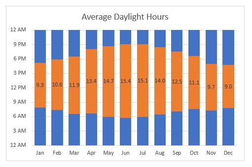
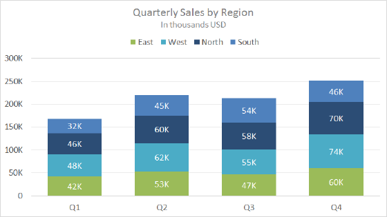
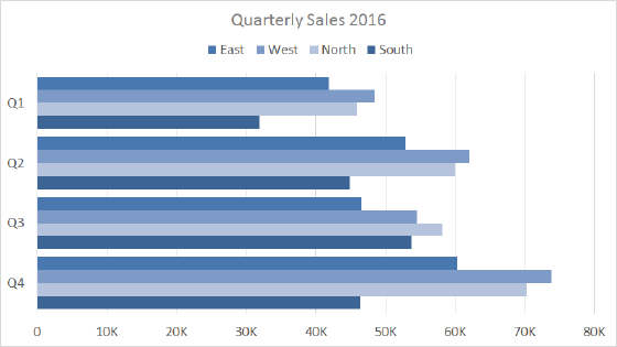
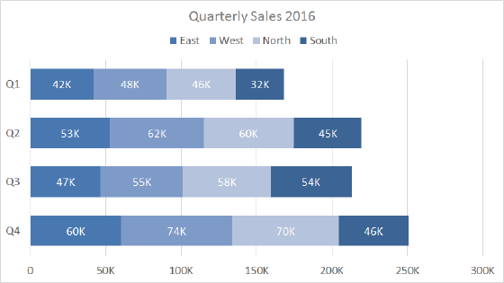
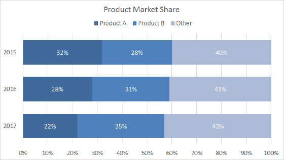
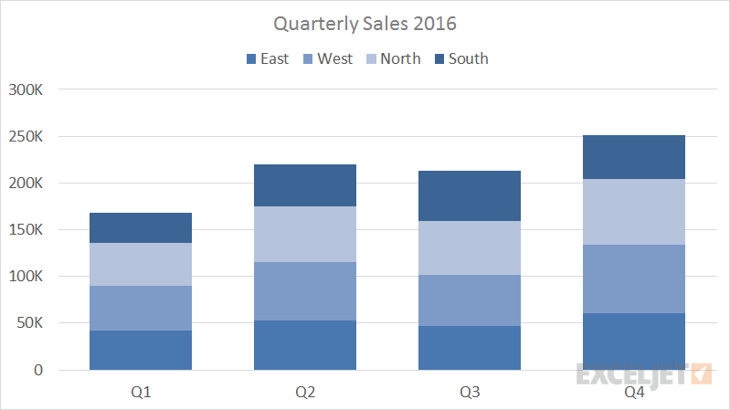
A stacked column chart is a basic Excel chart type to allow part-to-whole comparisons over time, or across categories. In a stacked column chart, data series are stacked one on top of the other in vertical columns.

Stacked column charts can show change over time because it's easy to compare total column lengths. However, except for the first series of data (next to the x-axis) and total bar length, it's difficult to compare the relative size of the components that make up each bar. As categories or data series are added, stacked column charts quickly become complicated.

Pros

  • Multiple categories and data series in compact space
  • Can show change over time

Cons

  • Difficult to compare all but first series
  • Become visually complex as categories or series are added

Tips

  • Limit data series and categories
  • Avoid all 3d variants

Chart Examples

Column charting showing the effect of seasons on sunrise and sunset times

Daylight hours from sunrise to sunset

This chart is an example of a column chart that uses a "floating bar" technique to plot daylight hours on the chart in way that makes the bars look like the are floating above the horizontal axis. The trick in this case is to create three helper columns that do not exist in the original data:...Read more

Example stacked column chart - quarterly sales by stacked region

Quarterly sales by stacked region

This chart shows quarterly sales, broken down by quarter into four regions that are stacked, one on top of the other. Stacked column charts can work well when the number of data series and categories is limited. This chart also shows how to use a custom number format ([>=1000]#,##0,"K";0) to...Read more