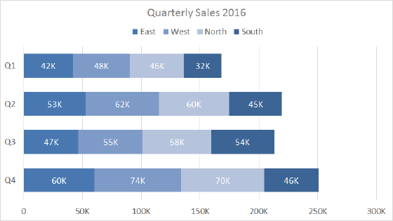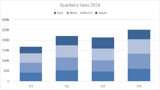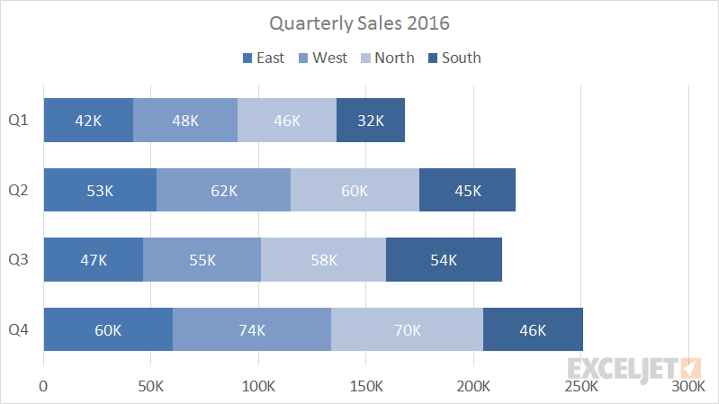
A stacked bar chart is a basic Excel chart type meant to allow comparison of components across categories. Data is plotted using horizontal bars stacked from left to right.
Stacked bar make it easy to compare total bar lengths. However, except for the first series of data (next to the axis) it's more difficult to compare the relative size of the components that make up each bar. Also, as categories or data series are added, stacked column charts quickly become visually complex.
Pros
- Multiple categories and data series in a compact space
- Able to show change over time of category sub-components
Cons
- Difficult to compare all but first series
- Become visually complex as categories or series are added
Tips
- Limit data series and categories
- Avoid all 3d variants