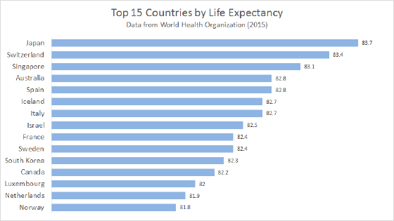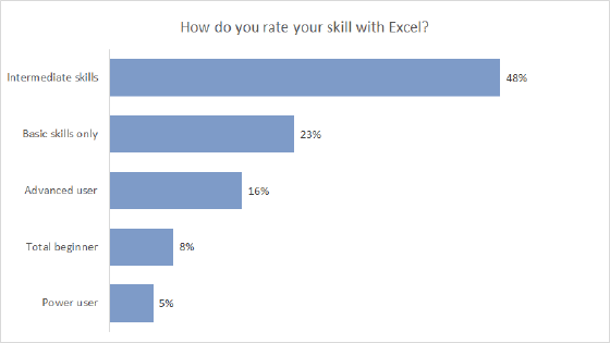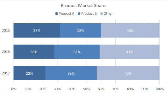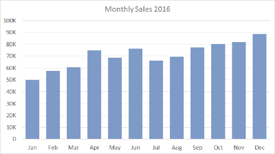
A bar chart is one of Excel's primary chart types and a good choice for categorical data. Bar charts plot data using horizontal bars, so they are very easy to read because the human eye can easily compare bars. Also, because of the horizontal layout, bar charts have room to accommodate longer category names.
Bar charts are also versatile. They can be used to plot both nominal data and ordinal data, and they can be used instead of a pie chart to plot data with a part-to-whole relationship. If you're trying to decide on a chart type, a bar chart is a good first choice.
Pros
- Very easy to read
- Versatile
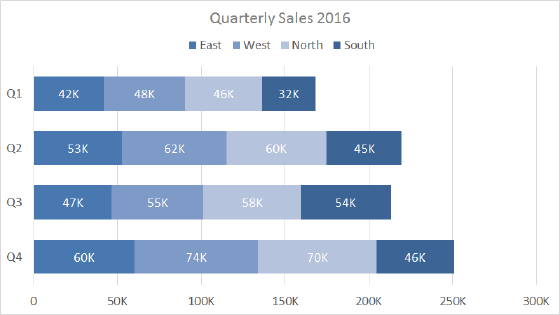
- Easy to add data labels at the ends of bars
- Room for longer text labels
Cons
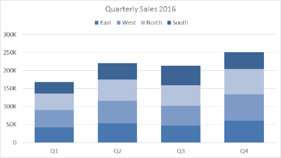
- Become cluttered with too many categories
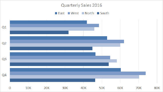
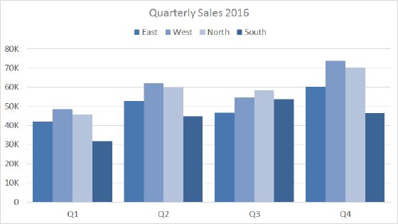
- Clustered bar charts are harder to read as data series are added
Tips
- Add data labels where it makes sense
- Sort bars by largest to smallest (unless data has a natural sequence)
- Avoid all 3d options