Summary

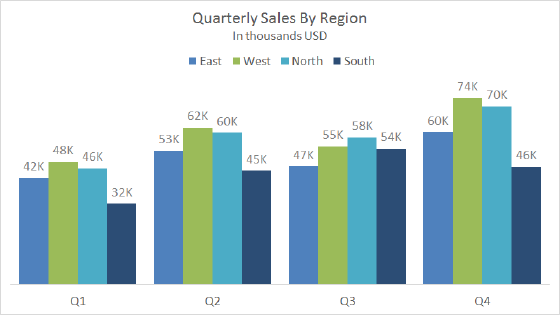
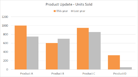
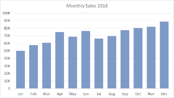
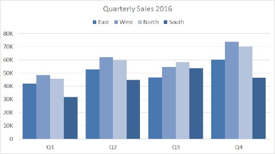
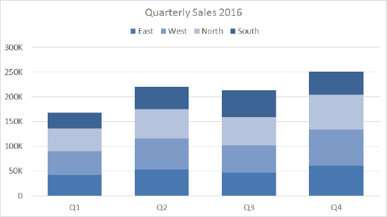
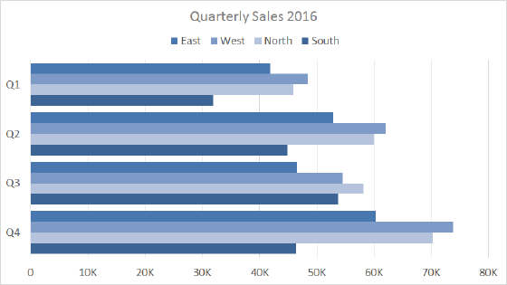
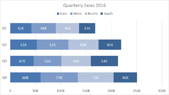
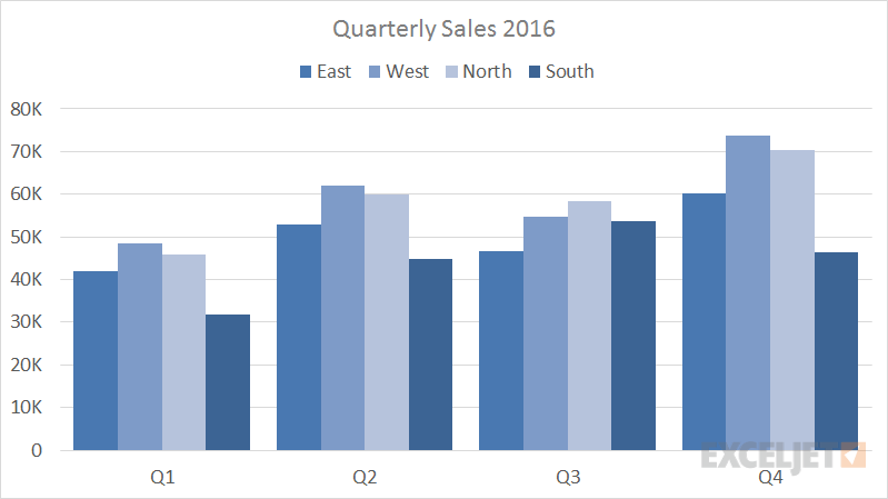
A clustered column chart displays more than one data series in clustered vertical columns. Each data series shares the same axis labels, so vertical bars are grouped by category.  Clustered columns allow the direct comparison of multiple series, but they become visually complex quickly. They work best in situations where data points are limited.

Pros

  • Allow direct comparison of multiple data series per category
  • Can show change over time

Cons

  • More difficult to compare a single series across categories
  • Become visually complex as categories or series are added

Tips

  • Limit data series and categories
  • Avoid all 3d variants

Chart Examples

Example stacked column chart - quarterly sales by clustered region

Quarterly sales by clustered region

This chart shows quarterly sales data, broken down by quarter into four regions plotted with clustered columns.Clustered column charts work best when the number of data series and categories is limited. In order to make the data labels fit into a narrow space,  the chart uses a custom number...Read more

Example clustered column chart comparing 4 products this year vs last

Products this year vs last year

Bar and column charts are great for comparing things, because it's easy to see how bar lengths differ. This chart is an example of a clustered column chart showing product units sold this year versus last year. The data used for this chart looks like this on the worksheet:

...Read more