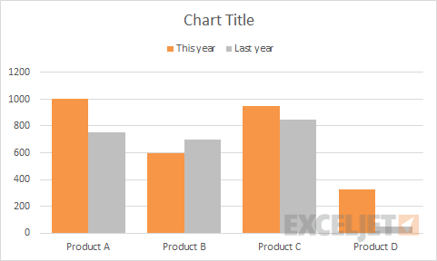
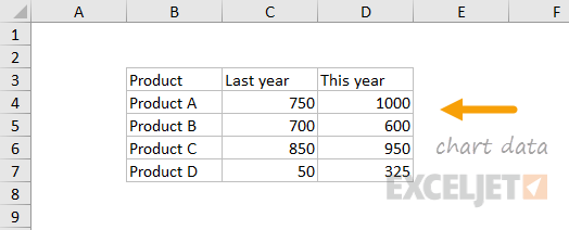
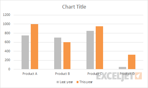
Bar and column charts are great for comparing things, because it's easy to see how bar lengths differ. This chart is an example of a clustered column chart showing product units sold this year versus last year. The data used for this chart looks like this on the worksheet:
Note: you can see the same data in a clustered bar chart.
How to make this chart
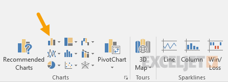
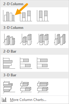
- Select the data and insert a bar char on the ribbon:
- Insert the first 2D bar chart option:
- Right-click each data series and use fill tool to change color:
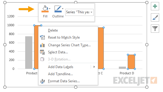
- After changing colors:
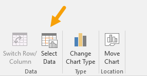
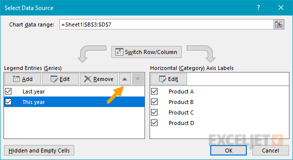
- Select chart data: Chart tools > Design > Select data
- Move this year series up:
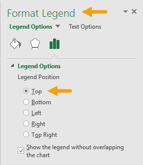
- Move legend to top:
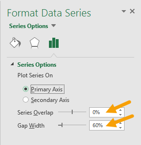
- Select data series and set overlap to zero and bar width to 60%:
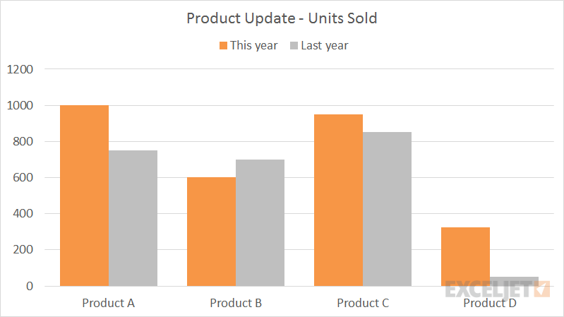
- Final chart: