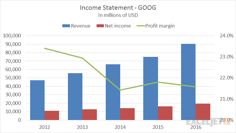
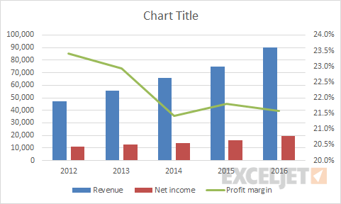
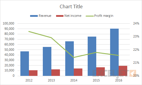
Income statements are commonly shown in a combo chart, with columns plotting revenue and net income, and a line showing the profit margin as a percentage. You can see examples of this on Google's finance pages. This kind of chart is easy to make in later versions of Excel by inserting a combo chart.
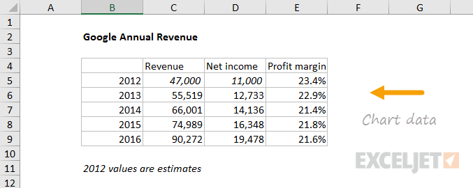
The data used to create this chart is shown below:
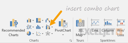
How to make this chart
- Select the data and insert a "combo chart"
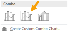
- Select the send option - columns with line on secondary axis:
- The initial chart looks like this:
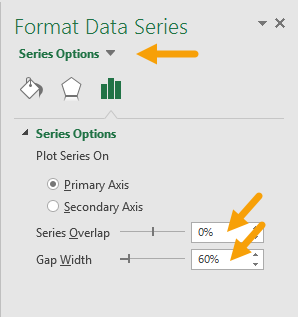
- Select revenue columns, then set series overlap and gap with
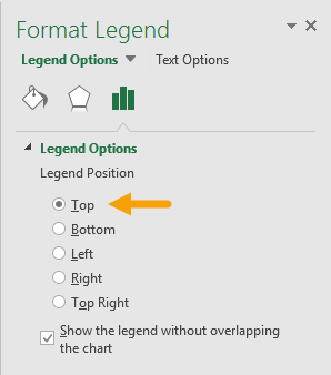
- Select legend and move to top:
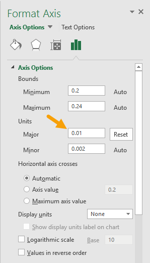
- Select secondary axis and set units to major units to .01 (1%):
- Chart at this point:
At this point you can finalize the chart by setting the chart title, chart size, and font size for all text.