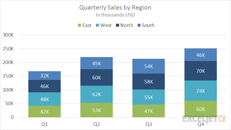
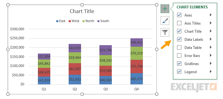
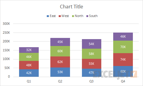
This chart shows quarterly sales, broken down by quarter into four regions that are stacked, one on top of the other. Stacked column charts can work well when the number of data series and categories is limited. This chart also shows how to use a custom number format ([>=1000]#,##0,"K";0) to show values in thousands.
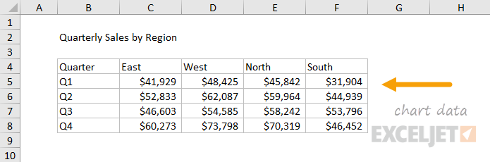
The data used to plot this chart is shown below:
See also: Same data in a clustered column chart.
How to make this chart
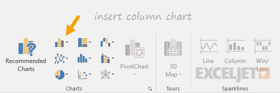
- Select the data and insert a column chart:
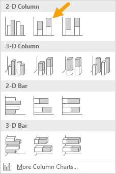
- Select the stacked column option
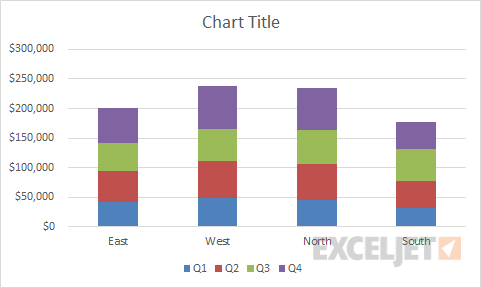
- Initial chart:
- Switch rows and columns to group data by quarter:
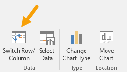
- After switching rows and columns:
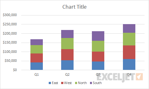
- Move legend to top:
- Add data labels:
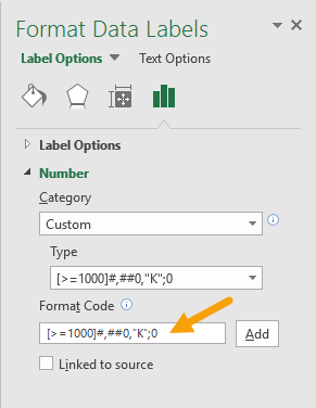
- Select data labels, fill white, then apply custom number format for thousands:
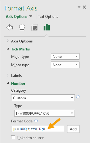
- Select axis and apply same number format:
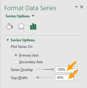
- Set series overlap and gap width:
- Final stacked column chart:
At this point, you can finalize the chart by setting a title, and adjusting the overall chart size and font size for text objects.