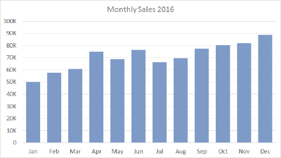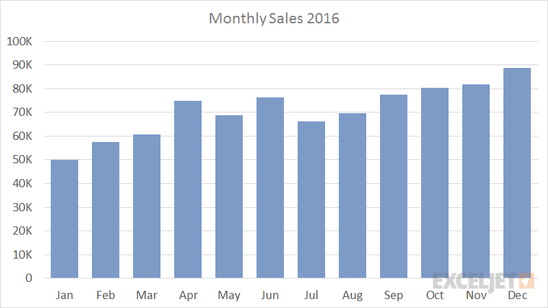
A column chart is a primary Excel chart type, with data series plotted using vertical columns. Column charts are a good way to show change over time because it's easy to compare column lengths. Like bar charts, column charts can be used to plot both nominal data and ordinal data, and they can be used instead of a pie chart to plot data with a part-to-whole relationship.
Column charts work best where data points are limited (i.e. 12 months, 4 quarters, etc.). With more data points, you can switch to a line graph.
Pros
- Easy to read
- Simple and versatile
- Easy to add data labels at ends of bars
Cons
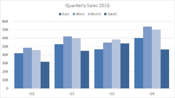
- Become cluttered with too many categories
- Clustered column charts can be difficult to interpret
Tips
- Add data labels where when it makes sense
- Avoid all 3d variants