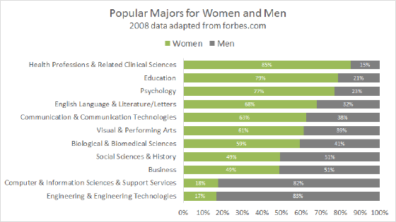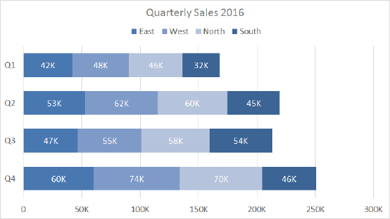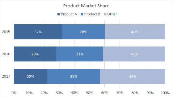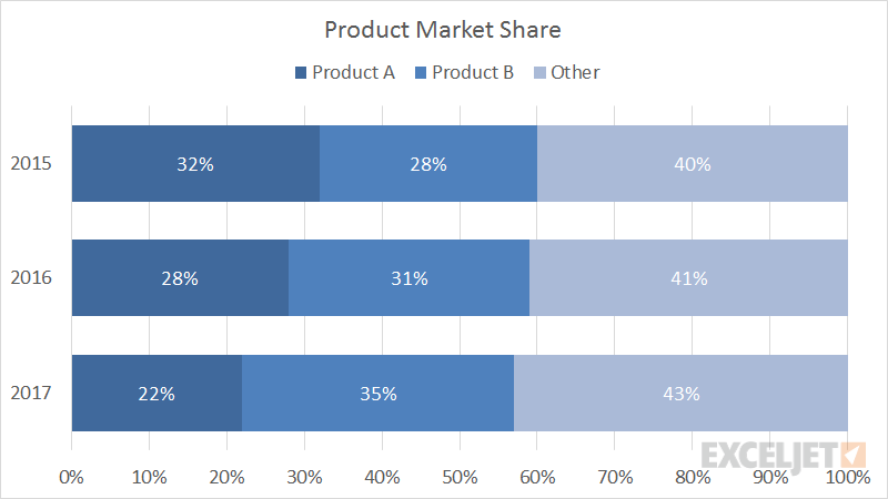
A 100% stacked bar chart is an Excel chart type designed to show the relative percentage of multiple data series in stacked bars, where the total (cumulative) of each stacked bar always equals 100%. Like a pie chart, a 100% stacked bar chart shows a part-to-whole relationship. However, unlike a pie chart, a 100% stacked bar chart can show how proportions change over time, for example, product market share changes per year, as shown above.
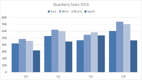
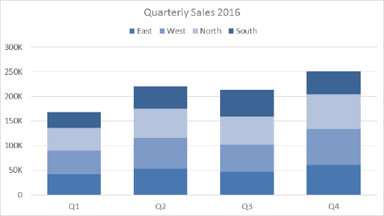
Like all stacked bar charts, the first data series (next to the axis) is easy to compare visually, but subsequent data series are harder to compare, since they aren't aligned to a common element.
Pros
- Able to show part-to-whole changes over time
- Multiple categories and data series in compact space
Cons
- Difficult to compare all but first series
- Stacked bars normalized to 100% so absolute value dimension is lost
- Become visually complex as categories or series are added
Tips
- Limit data series and categories
- Avoid all 3d variants