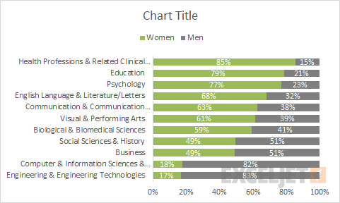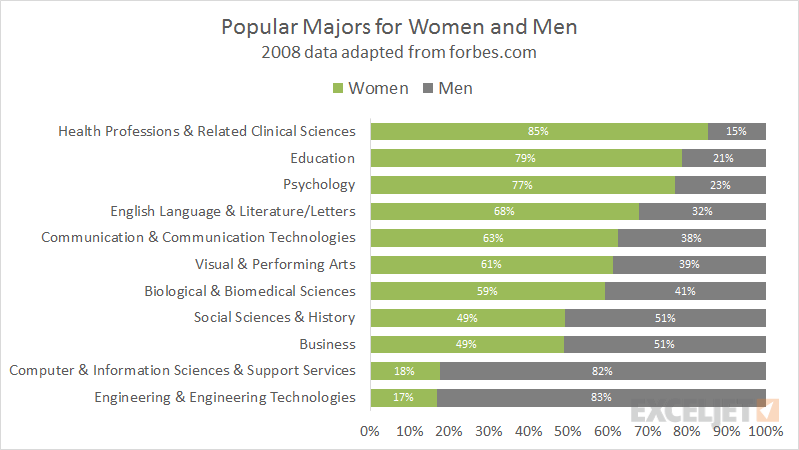
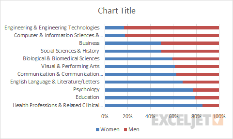
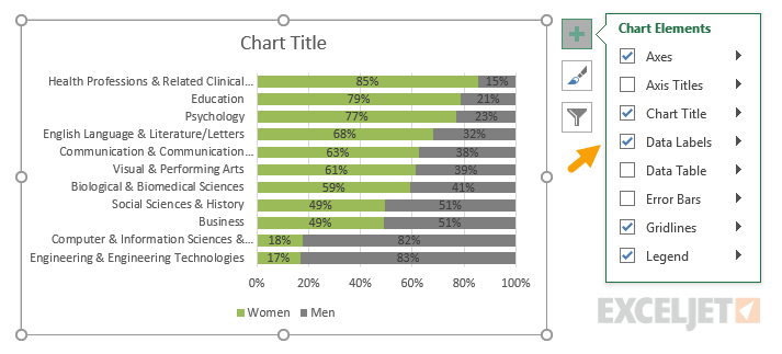
I was looking at an article on forbes.com about popular college degrees for women and men. They listed 9 degrees for both women and men (on many, many pages), and this chart is just a mash-up of the data they cited, sorted to show popular degrees for women at the top.
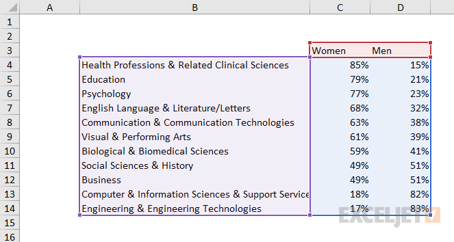
The chart type is 100% stacked bar, and its a good example of how a bar charts can accommodate extremely long labels. The data used in the chart looks like this:
How to make this chart
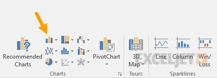
- Select data and insert column chart via ribbon:
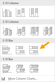
- Choose 100% stacked bar chart under 2d bars:
- Chart as inserted:
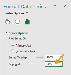
- Select data series and increase bar width:
- Select each data series and set desired color.
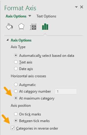
- Select data series for women and reverse category:
- Add Data Labels:
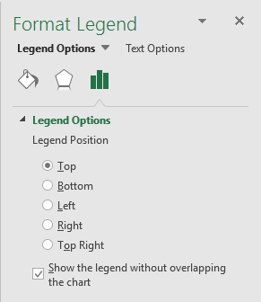
- Move legend to top:
- Select and delete gridlines
- Set title as desired
- Final chart before resizing and adjusting font size: