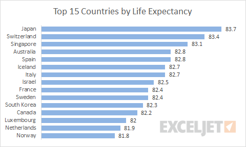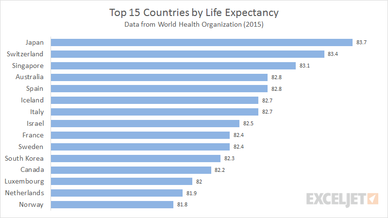
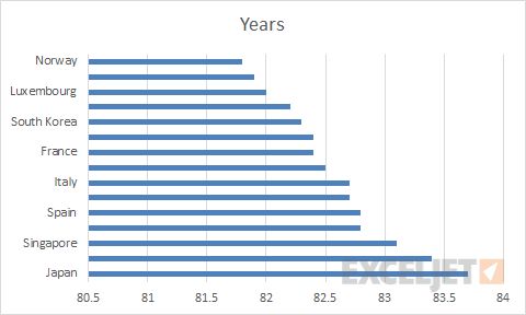
Which countries have the longest life expectancy? Bar charts work well for this kind of data because (1) the bars are easy to compare and (2) there is plenty of room for labels on the vertical axis.
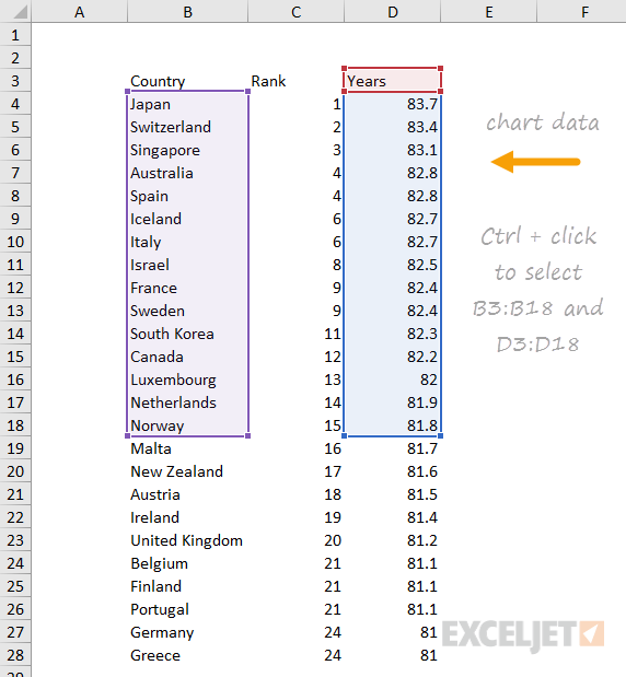
Here is the data used to plot this chart:
How to make this chart
- Hold down control key and select ranges as shown above
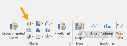
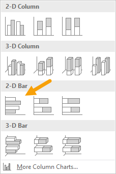
- Click the insert column icon at Insert > charts
- Select the first 2d option
- The chart as inserted
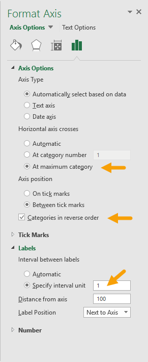
- Select vertical axis; reverse sort order and set interval to 1
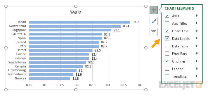
- Add data Labels
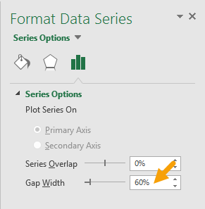
- Select data series and set bar width
- Select and delete gridlines
- Select and delete horizontal axis
- Set title as desired
- Final chart after changes