Summary

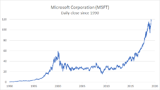
A line chart is a built-in Excel chart type, with each data series plotted as a separate line. Line charts are a good way to show change or trends over time. In contrast to column or bar charts, line charts can handle more categories and more data points without becoming too cluttered. Line charts can be customized to show or hide data markers of various shapes and sizes.

Pros

  • Simple presentation; easy to read and create
  • Clean presentation of multiple data series with many data points
  • Good for showing trends over periods of time
  • Can handle positive and negative values

Cons

  • Harder to read when lines overlap frequently
  • Line can imply more data than actually available (compared to bar or column chart)

Chart Examples

Plotting a line chart with thousands of data points

Line chart with many data points

This example shows a line chart plotted with over 8000 data points. The data itself is daily stock market information for Microsoft Corporation over a period of more than 30 years.  Only the closing price is plotted. When you first create a line chart with this much data, the x-axis will be...Read more

Example floating column chart, made with line chart + up down bars

Floating column chart with up down bars

One of the charts you'll see around is a so called "floating column chart", where columns rise up off the horizontal axis to depict some sort of value range. There are many ways to make this kind of chart in Excel, and Jon Peltier has a...Read more

Example of line chart with actual and forecast

Line chart actual with forecast

This chart shows actuals so far in a solid line with forecast numbers in a dashed line. The chart type is set to line chart, and actual and forecast values are plotted as two data series. The data used for the chart is set up as shown below:

...Read more