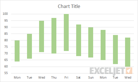
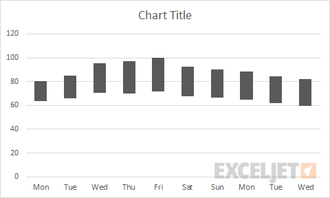
One of the charts you'll see around is a so called "floating column chart", where columns rise up off the horizontal axis to depict some sort of value range. There are many ways to make this kind of chart in Excel, and Jon Peltier has a very comprehensive run-down here.
This page describes just one approach, where you make a line chart with two data series (one high, one low) and then use "up/down bars" to create the floating columns. The advantage of this approach is simplicity. There is no need to add calculations and a ghost data series to float the columns, as you'll see in other examples.
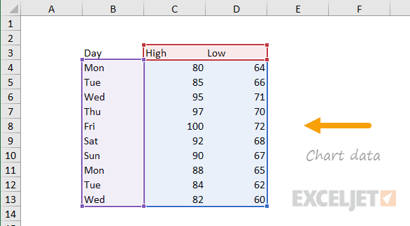
The data used to make the chart on this page looks like this:
How to make this chart
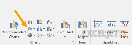
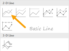
- Place cursor in data and insert a line chart:
- Select the standard 2D option:
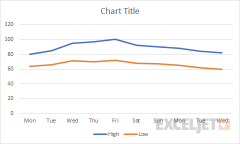
- The chart as inserted:
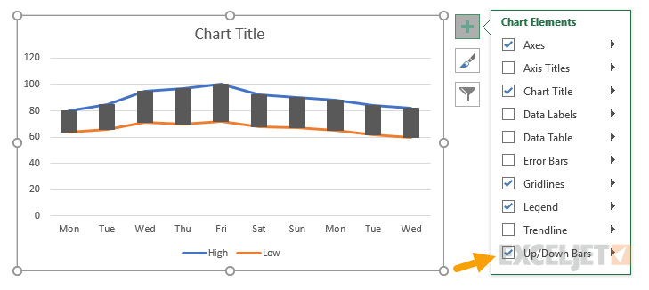
- Select the chart and add up/down bars:
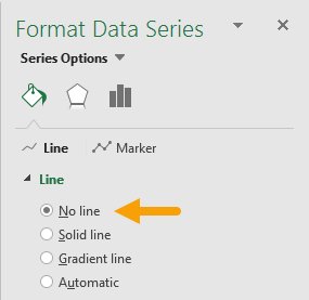
- Select each data series in turn and set line to "no line":
- Chart after setting both data series to "no line":
- Select and delete legend
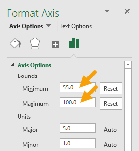
- Select vertical axis and set bounds to 100 and 55:
- Select up/down bars and change color and border as desired
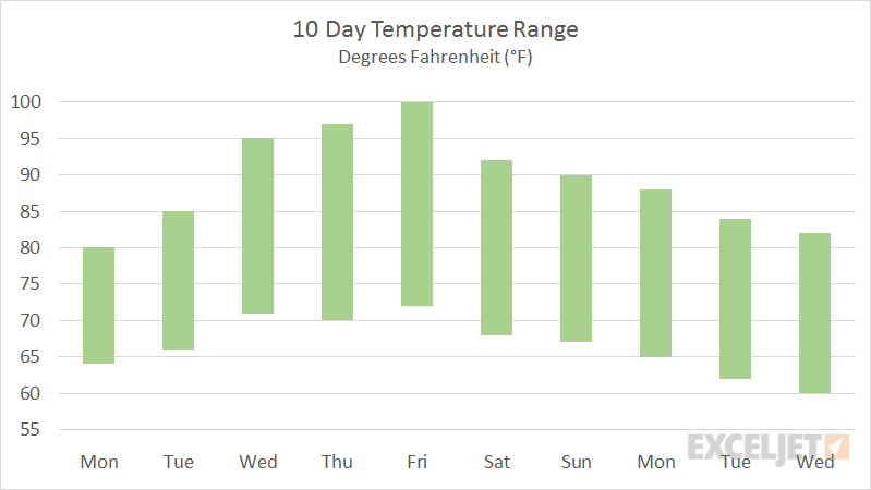
- Final chart before title and sizing: