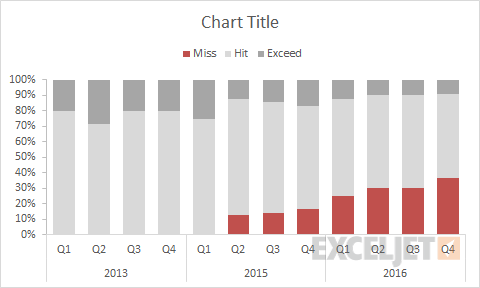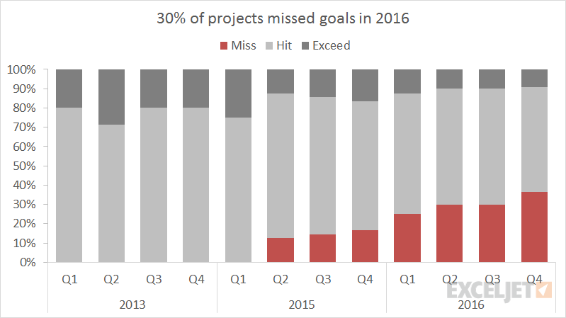
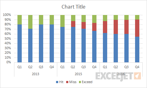
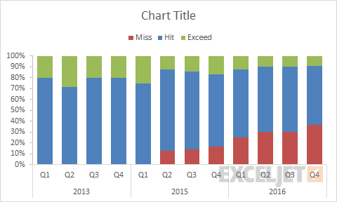
This chart is an example of a 100% stacked column chart. The data shown in the chart represents projects over a three year period, categorized as hit goals, missed goals, and exceeded goals. I think this is a good example of how a 100% stacked column chart can work well to show trends over time, in this case highlighting the worrying trend of more projects with missed goals.
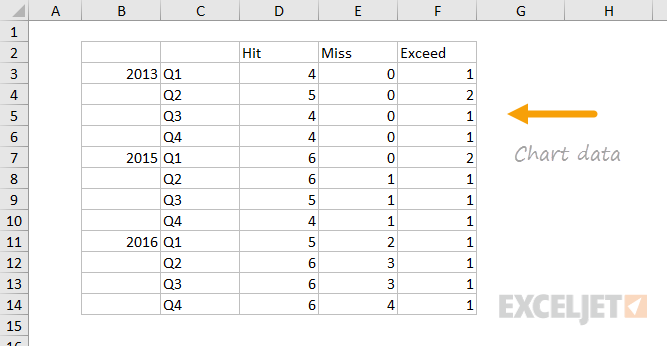
The data used to plot the chart looks like this:
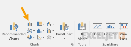
How to create this chart
- Select data and Insert > Column chart on Ribbon:
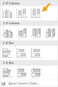
- Choose the 2D 100% stacked column option:
- Chart as inserted:
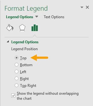
- Move legend to top of chart:
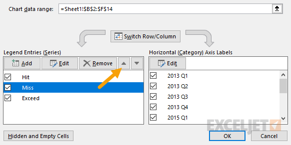
- Select data on the ribbon (or right click to select)
- Reorder series to plot missed data first:
- Reorder series to plot missed data first:
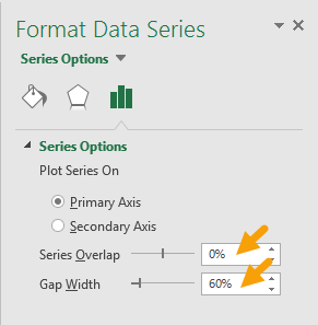
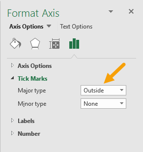
- Set tick marks on vertical axis:
- Select and delete horizontal grid lines
- Chart at this point in the process:
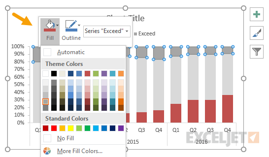
- Right click each series and set fill color:
- Final chart before resizing and setting title: