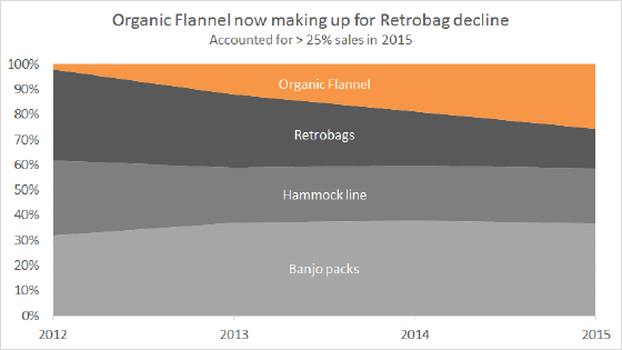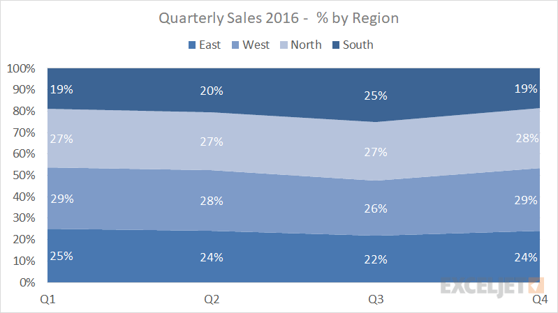
A 100% Stacked Area Chart is a built-in Excel chart type, with data plotted as areas and stacked so that the cumulative area always represents 100%. Stacked Area charts can show progression and composition over time, and the 100% Stacked Area Chart is meant to show the percentage that each component contributes when the cumulative total is not important.
In the example above, the number formatting used for percentages is 0% (no decimal places). As a result, the numbers don't add up to exactly 100 in some cases. To show numbers that do add up to 100, increase the number of decimal places displayed.
Pros
- Can show trends over periods of time
- Can show component contribution changes over time
Cons
- Non-intuitive presentation may be unfamiliar to many
- Hard to read as data series are added