Summary

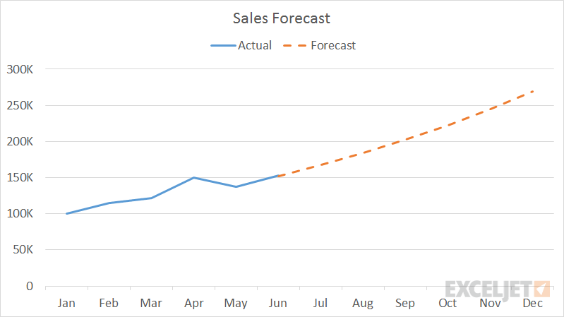
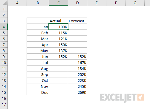
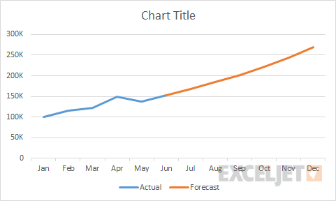
This chart shows actuals so far in a solid line with forecast numbers in a dashed line. The chart type is set to line chart, and actual and forecast values are plotted as two data series. The data used for the chart is set up as shown below:

Worksheet data used for line chart

How to make this chart

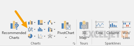
  1. Select the data and insert a line chart:
    Insert line chart from ribbon
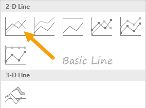
  2. Choose the first option, a basic line chart:
    Select first option for basic line chart
  3. Chart as inserted:
    After inserting a basic line chart
  4. Select Forecast data series and apply dashed line:
    Set dashed line under Format Series
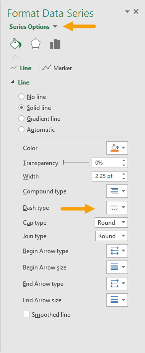
  5. After setting dashed line on Forecast data series:
    After setting dashed line on 2nd data series

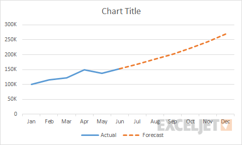
From this point, you can set the chart title and move the legend.


Dave Bruns Profile Picture

AuthorMicrosoft Most Valuable Professional Award

Dave Bruns

Hi - I'm Dave Bruns, and I run Exceljet with my wife, Lisa. Our goal is to help you work faster in Excel. We create short videos, and clear examples of formulas, functions, pivot tables, conditional formatting, and charts.