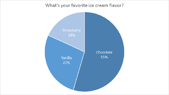
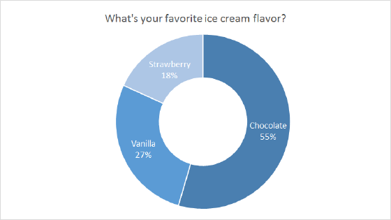
The Bar of Pie Chart is a built-in chart type in Excel. Pie charts are meant to express a "part to whole" relationship, where all pieces together represent 100%.
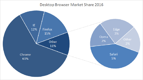
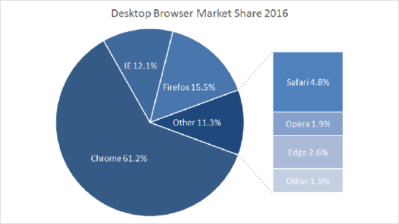
Pie charts work best to display data with a small number of categories (2-5). The Bar of Pie Chart provides a way to add additional categories to a pie chart without generating a pie chart too complex to read. When configuring a Bar of Pie chart, Excel provides a setting that moves the smallest n slices of the pie to the bar, where n can be adjusted to suit the data.
Bar of pie charts should be avoided when there are many categories, or when categories do not total 100%. The human eye has trouble comparing the relative size of slices in a pie chart, and this problem is magnified with the pie of pie variety.
Pros
- A simple way to handle more categories in a pie chart
- Can be read "at a glance" with limited categories
- Excel can calculate and display percentages automatically as data labels
Cons
- Difficult to compare relative size of slices
- Become cluttered and dense as categories are added
- Limited to part-to-whole data
- Poor at showing change over time
Tips
- Limit categories
- Avoid all 3d variants