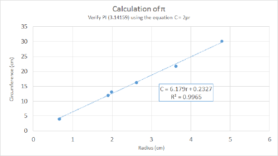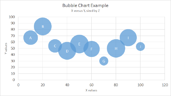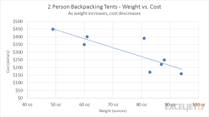
A scatter plot is a built-in chart type in Excel meant to show the relationship between two variables. A scatter plot works by placing one variable on the vertical axis and a different variable on the horizontal axis. Each piece of data is then plotted as a discrete point on the chart. In a scatter plot, both the X and Y axis display values – an XY chart has no category axis.
By convention, the X axis represents arbitrary values that do not depend on another variable, referred to as the independent variable. Y values are placed on the vertical axis, and represent the dependent variable.
Pros
- Can show the relationship of one variable to another
- Visual display of correlation
- Ideal for many types of scientific data
Cons
- Not as well understood as many other chart types
- Suitable only for data where correlation is expected