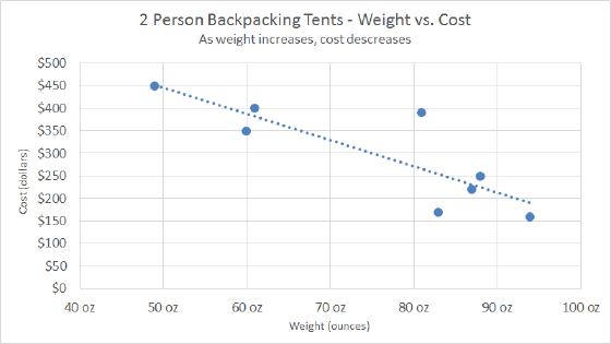
The Bubble Chart is a built-in chart type in Excel. Bubble charts are a special kind of XY chart that can display another data series which is used to scale the bubble (marker) plotted at X and Y values. You can think of a bubble chart as "X versus Y, scaled by Z". Like a regular XY scatter chart, both axes are used to plot values – there is no category axis.
Pros
- Can show the relationship of one variable to another
- Unique ability to show data about a third dimension
- Can visually display correlation
Cons
- Unusual chart type may be difficult to ready for many people
- More difficult to set up than other chart types