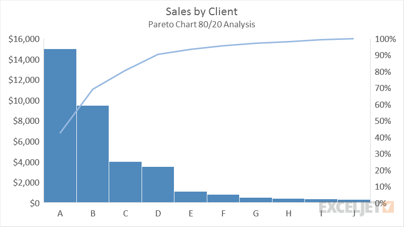
The Pareto Chart is a built-in chart type in Excel 2016. A Pareto chart is a variant of the histogram chart, arranged in descending order for easy analysis. The sequencing is performed automatically, and a separate line is added on a secondary axis to make it easy to see contribution toward 100% as columns are plotted to the left.
Pareto charts highlight the biggest factors in a set of data. Following the idea of 80/20 analysis, they try to show which (approximately) 20% of the categories contribute 80% of the data being measured. They are often used in process improvement to show which factors deserve the most attention.
Pros
- Quickly highlights most important data
- Excel automatically builds histogram and adds Pareto line
Cons
- Less common chart type may be difficult to ready for many people
- Built-in Pareto Chart is not as easy to customize as a standard combo chart