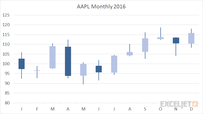
A Candlestick chart is a built-in chart type in Excel normally used to show stock price activity. You'll find this chart under the Stock category of chart types, with the name Open-High-Low-Close, sometimes abbreviated OHLC.
This chart type automatically plots the full range of values as a single line, with indicates high and low in a given time interval. On top of the line is a bar which indicates open and close values. Dark bars indicate close price is less than open price (a loss), light bars indicate a close price greater than open price (a gain).
Excel plots this chart in blank and white only by default.
Pros
- Quickly plot stock data in open high low close format
- At a glance indication of stock price activity
Cons
- Not as well understood as many other chart types
- A specific chart type mostly seen in the financial world