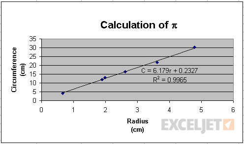
I ran into this chart while looking for examples of XY scatter plots and couldn't resist re-building it, following the instructions outlined way back in 2000 I think. Unfortunately the original link no longer works.
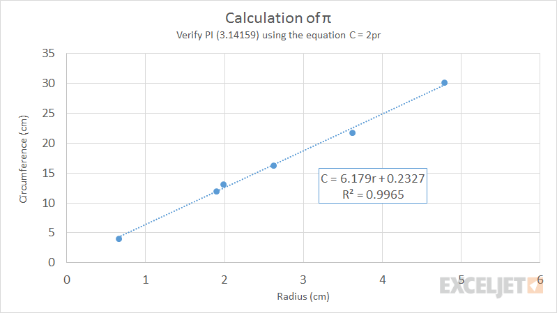
The exercise is to verify the value of pi by plotting the circumference vs. radius of a number of objects measured in a lab. Here is the data:
| circumference | radius |
|---|---|
| 4.08 | 0.66 |
| 11.94 | 1.89 |
| 13.18 | 1.98 |
| 16.34 | 2.62 |
| 21.78 | 3.62 |
| 30.16 | 4.78 |
Here is the original result: