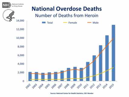
I first saw a reference to this data on the interesting News, in Data site. The data cited comes from the drugabuse.gov website, and is presented in a combo chart with columns showing overall heroin deaths and lines showing the male and female breakdown. As the site says, from 2002 to 2015 there was a 6.2-fold increase in the total number of deaths. Here's one of the original charts:

Since there are 14 columns in the chart, and the lines are somewhat hard to interpret, I though it would be interesting to plot the data in a stacked area chart. Stacked area charts aren't so good at showing individual data points, but they work well to show overall trends. Also, unlike column charts, they can handle way many more data points without becoming cluttered. The example up top actually plots 3 more years of data, going back to 1999.
It would be interesting to show the average street price of heroin during this same period. If you have a source for that data, let me know in a comment below.


