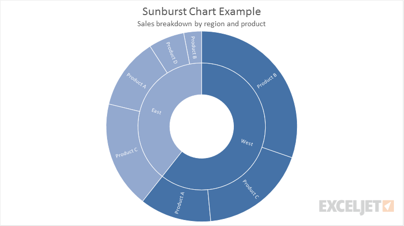
The sunburst chart is a built-in chart type in Excel 2016+. A sunburst chart is used to display hierarchical data in a circular format where each level of the hierarchy is represented as a ring. Top level categories make up the inner ring, and sub-categories are plotted as outer rings. Segments in each ring are sized proportionally using a value series. Like a treemap chart, the sunburst chart can be used to compare relative sizes.
Pros
- Quick visualization of hierarchical data
- At-a-glance breakdown of data in categories
Cons
- Data must be sorted by category
- Limited options for controlling format and presentation