Summary

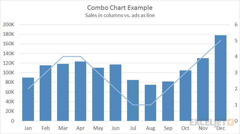
A Combo Chart is a hybrid of two more chart types, for example, a column chart plus a line chart.

Pros

  • Able to display multiple chart types in a single chart
  • Able to plot values with completely different sales
  • Can show how one factor is influenced by another

Cons

  • Inherently more complex than other chart types
  • Can become complicated quickly

Chart Examples

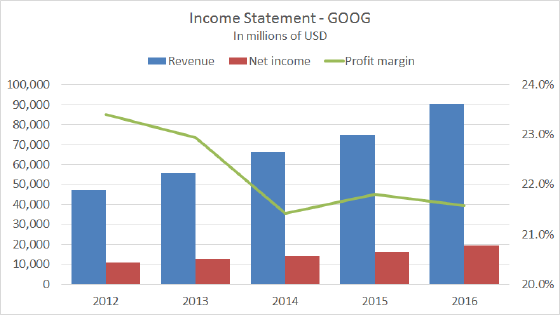
Income statement annual data

Income statements are commonly shown in a combo chart, with columns plotting revenue and net income, and a line showing the profit margin as a percentage. You can see examples of this on Google's finance pages. This kind of chart is easy to make in later versions of Excel by inserting a combo chart. …...Read more

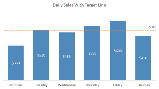
Column chart with target line

Combo charts combine more than one Excel chart type in the same chart. One way you can use a combo chart is to show actual values in columns together with a line that shows a goal or target value. In the chart shown in this example, daily sales are plotted in columns, and a line shows target sales …...Read more