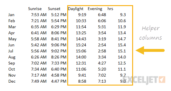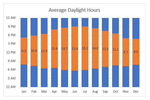
This chart is an example of a column chart that uses a "floating bar" technique to plot daylight hours on the chart in way that makes the bars look like the are floating above the horizontal axis. The trick in this case is to create three helper columns that do not exist in the original data: daylight, evening, and hrs. The video here walks through this process.
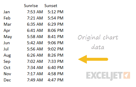
Original data
Data with helper columns