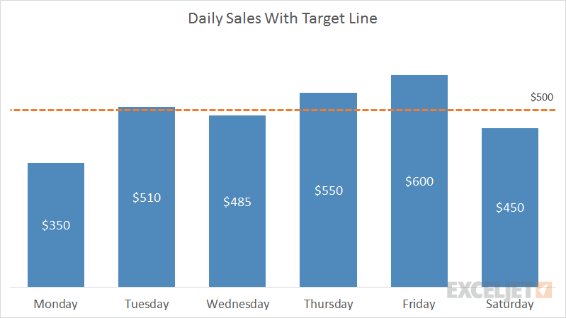
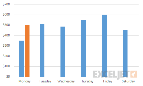
Combo charts combine more than one Excel chart type in the same chart. One way you can use a combo chart is to show actual values in columns together with a line that shows a goal or target value. In the chart shown in this example, daily sales are plotted in columns, and a line shows target sales of $500 per day.
This example uses a combo chart based on a column chart to plot daily sales and an XY scatter chart to plot the target. The trick is to plot just one point in the XY scatter chart, then use error bars to create a continuous line that extends across the entire plot area.
Data
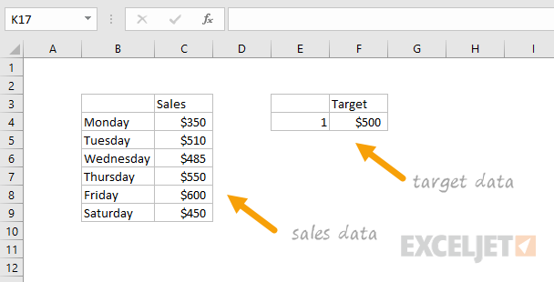
The data used to build this chart is shown below:
How to create this chart
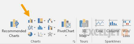
- Select the sales data and insert a Column chart
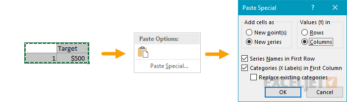
- Select target line data and copy. Then select chart > paste special:
- Column chart after pasting target line data:
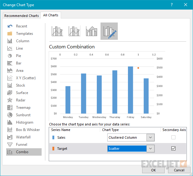
- Right-click chart, then change chart type to Combo Chart:

- Make Target Series an XY Scatter Chart
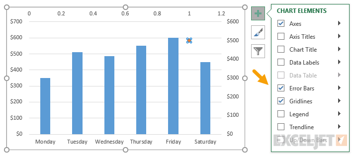
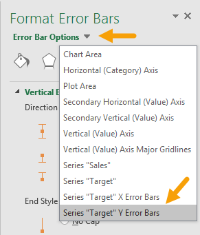
- Select target data point, then add error bars to chart
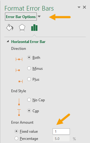
- Select X (horizontal) error bar; set Fixed value = 1.
- Select Y error bars, then press delete to remove:
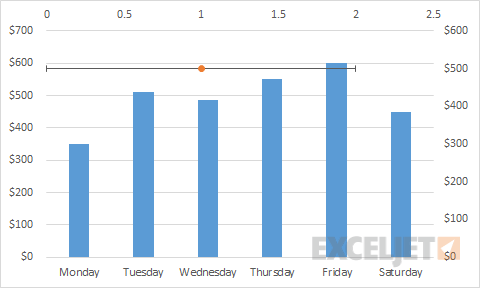
- Current chart after adjusting X error bars and removing Y error bars:
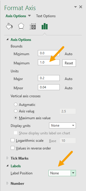
- Select secondary value axis, then set Maximum bounds = 1, and Label Position = "None":
- Select and delete secondary vertical axis.
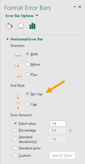
- Select horizontal error bar and set end style = "No Cap":
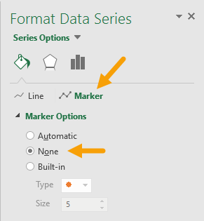
- Set Target data series marker to "None":
- Current chart with sales in columns and target as edge-to-edge line :
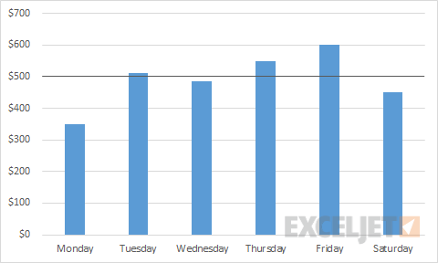
From this point, you have the basic column chart with edge-to-edge target line.
You can now format the chart as you like: add a title, set color and width for the target sales line, add data labels, etc.
Note: I learned the error bar approach from Excel chart guru Jon Peltier.