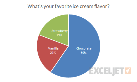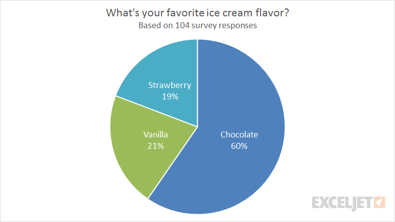
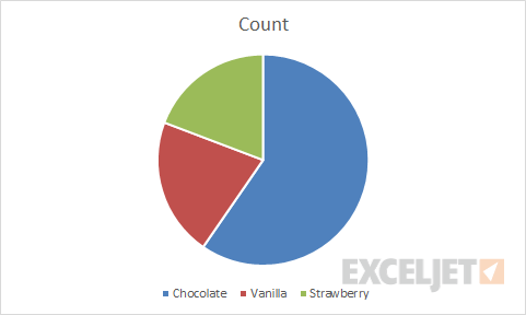
Pie charts are one of the simplest chart types in Excel, good for showing "part-to-whole" relationships with data in a small number of categories. Pie charts get a lot of criticism in the professional data visualization world, but they are compact and effective when the number of categories is small (2-5) and the relative size of each category is clear. In this example, a pie chart is used to plot the results of the survey question "What's your favorite flavor of ice cream?".
The data used for this pie chart is below:
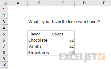
Note data does not include percentage breakdown — this is handled directly in the chart.
How to make this chart
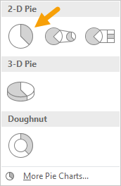
- Select the data, then Insert > Pie chart on the ribbon:

- Chose the first 2D pie option:
- Initial chart after insert:
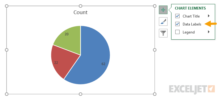
- Select and delete the legend
- Add data labels:
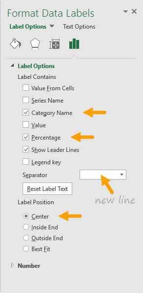
- Select data labels, and set display to show category name and percentage with a new line separator:
- Set data label text to white (if desired)
- Final chart with title: