Summary

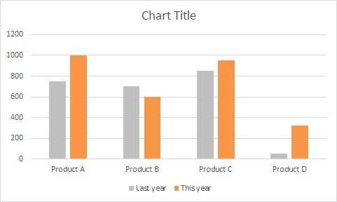
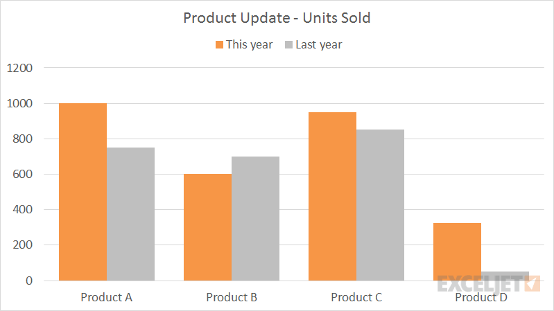
Bar and column charts are great for comparing things, because it's easy to see how bar lengths differ. This chart is an example of a clustered column chart showing product units sold this year versus last year. The data used for this chart looks like this on the worksheet:

Data for clustered column chart

Note: you can see the same data in a clustered bar chart.

How to make this chart

  1. Select the data and insert a bar char on the ribbon:
    Insert > column chart via ribbon
  2. Insert the first 2D bar chart option:
    Choose basic 2D column chart option
  3. Right-click each data series and use fill tool to change color:
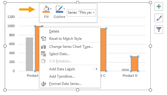
    Right click data series and use fill tool to change color
  4. After changing colors:
    Chart after data series color change
  5. Select chart data: Chart tools > Design > Select data
    Select chart data to reorder series
  6. Move this year series up:
    Reorder data series with Select Data window
  7. Move legend to top:
    Select legend and move to top
  8. Select data series and set overlap to zero and bar width to 60%:
    Select data series and set overlap to zero and bar width to 60%
  9. Final chart:
    Final clustered column chart
Dave Bruns Profile Picture

AuthorMicrosoft Most Valuable Professional Award

Dave Bruns

Hi - I'm Dave Bruns, and I run Exceljet with my wife, Lisa. Our goal is to help you work faster in Excel. We create short videos, and clear examples of formulas, functions, pivot tables, conditional formatting, and charts.