Summary
In this article, we take a short tour of some "unconventional" pivot tables you probably haven't seen before. These are interesting pivot tables created to analyze something other than sales data.
One thing you might have noticed about pivot tables is that almost all the examples you see are based on sales data. This makes sense in a way: sales is where the money is, and companies always have sales data in one form or another. However, pivot tables can handle a lot more than just sales. Any time you need to work with data, you should be thinking about pivot tables.
To illustrate how flexible and useful pivot tables are, here are five interesting examples you probably haven't seen before. I'm not going to explain how to create each pivot table in this article (I'll leave that for another day). I just want to give you some ideas about how you can use pivot tables with your own data.
Time tracking
Imagine you need to log time for different clients and projects and periodically report your time by client and project. There are of course many applications dedicated to time-tracking, but you can easily create your own flexible system using Pivot Tables.
At a minimum, what you need to record is a date, the time you spent, the client name, and the project. So, after you enter the data consistently, you might end up with source data that looks something like this:
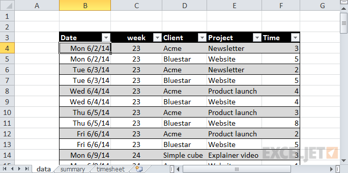
Note that there are no blank lines - you just need to enter the data as you go.
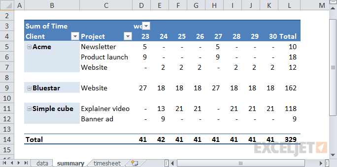
Now the summaries. First, you might want an overview of your time by week. Here we are using the week numbers provided by Excel's WEEKNUM function (see column C of the source data):
You might also want to arrange the pivot table to show a more traditional timesheet layout, with days of the week across the top:
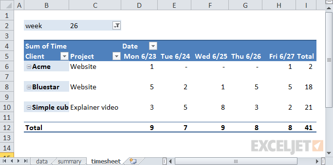
Each time you filter on a different week number, your pivot table will build a new time sheet that displays the dates that belong to the week. Note that by adding a column for Name to the data, you could track and report time for multiple people. You could also add a rate column to the data and use a pivot table to summarize the cost or billing rate of time logged.
We also have video training for Pivot Tables
User activity in a web portal
Imagine you're given a data dump from a large company's website. The website is a portal that provides product information to partners. Partners sign up on an ongoing basis throughout the year, and the portal has been running for a long time. You open up the data and take a look. Yikes. There are more than 30,000 users in there! The data looks something like this:
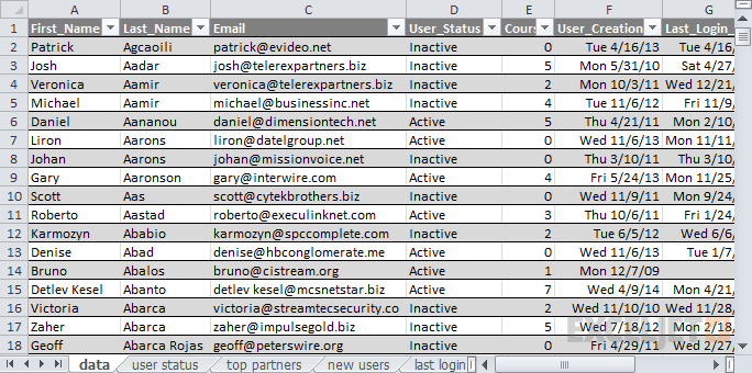
Lots of user data. Emails are fictitious, of course!
Your boss wants to know some basic information: how many users are currently active? How many users are being created each month? What partners have the most user accounts, and so on? Also, she's meeting the CEO at lunch. Can you get that info to her in the next hour? Gulp.
Before you panic and break out heavy-duty functions like COUNTIF, SUMIF, INDEX, and so on, take a deep breath. This kind of data is perfect for pivot tables, which will crunch through it quickly and still leave you time for a cup of coffee. First, active vs. inactive users. This kind of summary is a piece of cake with pivot tables, even with huge data sets:
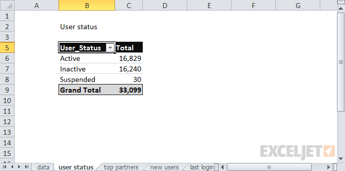
Interesting. Some users are "suspended". Who knew?
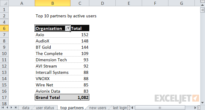
Next, the top 10 partners by number of active users. This is easily done by using the pivot tables built-in "Top 10" value filter.
And finally, by grouping user creation dates by year and month, you can easily show the complete history of user creation:
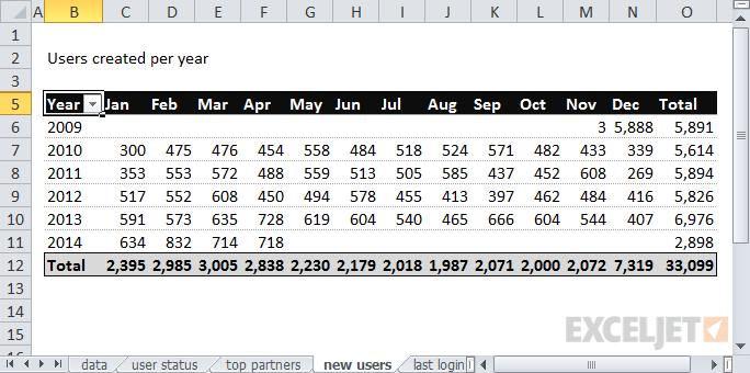
There must have been an import back in December 2009.
Class list
In this example, you're helping to coordinate sign-ups for a class that's offered on Mondays, Wednesdays, and Fridays. Each day during the sign-up period, you get a set of data that looks like this:
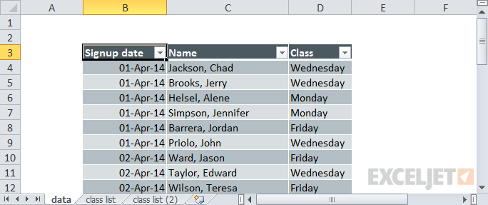
Note the data is formatted as a Table; important for updating later
Your job is to send a simple report to the instructor at the start of each day that shows current registrations. There's not a lot of data here, but if you create the report manually, you'll need to use some combination of filtering, sorting, copying, and pasting, and you'll have to repeat the process each day.
Once again, this is an easy job for a pivot table. Just build a simple pivot table that summarizes by class day:
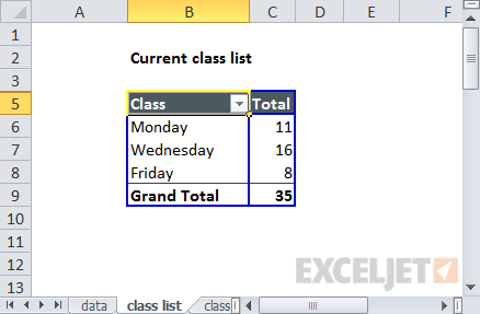
35 people have registered so far. Only 8 for the Friday class.
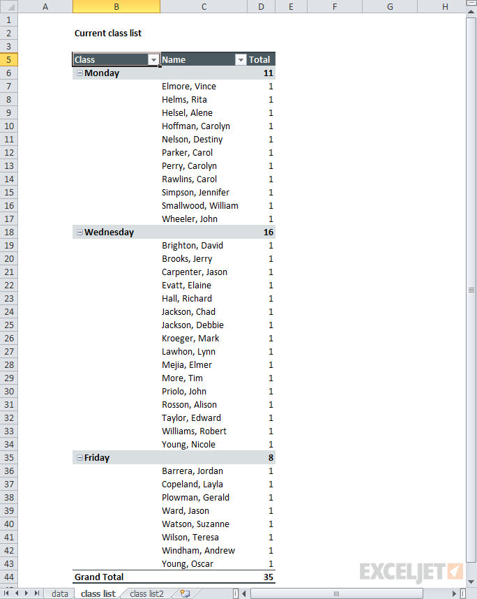
By adding names, you can quickly create a full class list.
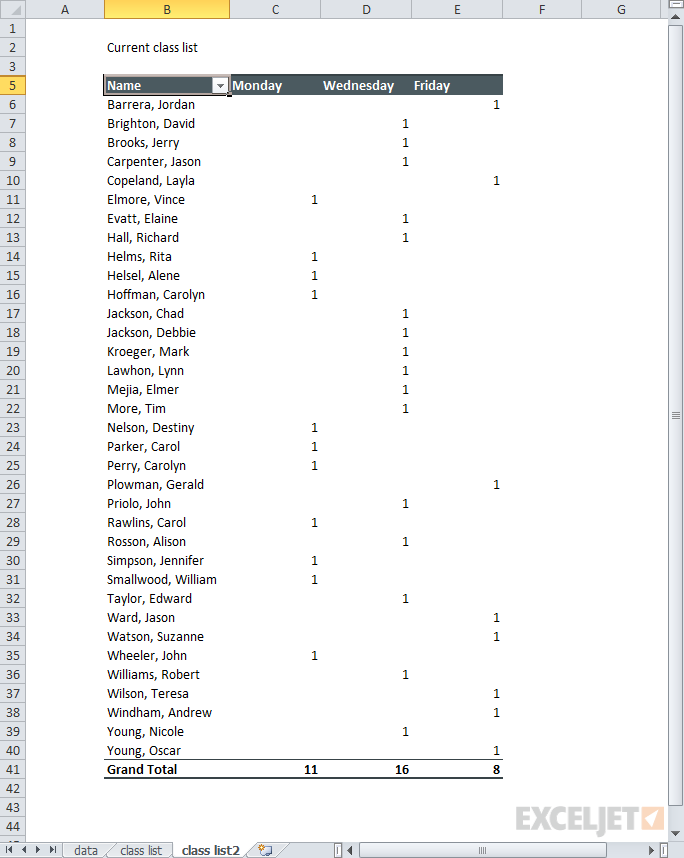
By moving the Class field into the column labels area, you can create a report that keeps all students together in alphabetical order.
One Pivot Table quirk is a tendency to want to count everything.
Now that you've got a report layout you like, how do you update the report each day? Simple. Just paste in the latest data, (overwriting the existing data) and refresh the pivot table(s). This should take less than a minute, with no busy work.
See also: Why should use a table for your Pivot table
Instrument measurements
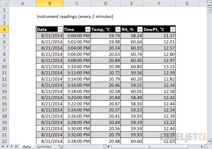
You've got measurement data from a system that records the temperature, relative humidity, and dew point in a greenhouse every two minutes. The data looks like this:
What you need is a quick breakdown that shows the average reading per hour. Yes, you could create formulas to do this, but it will be a lot of work. By flowing the data through a pivot table, you can simply add each measurement as a value, and change the display to show average instead of sum. This will give you a tidy summary that shows the average of each reading by hour:
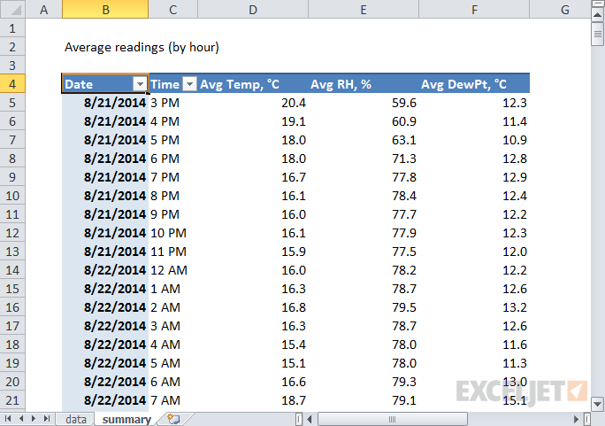
Average readings per hour in less than 5 minutes
Email signups
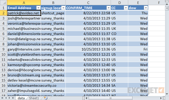
You're working with a client who is tracking email signups on their website. The client is planning a new marketing campaign and wants to know which day of the week is best for signups, based on the data they have so far. The day of the week is a little tricky since it doesn't appear anywhere in the data, but you can easily add it to the data using the WEEKDAY function. Your data now looks like this:
And the initial summary looks like this:
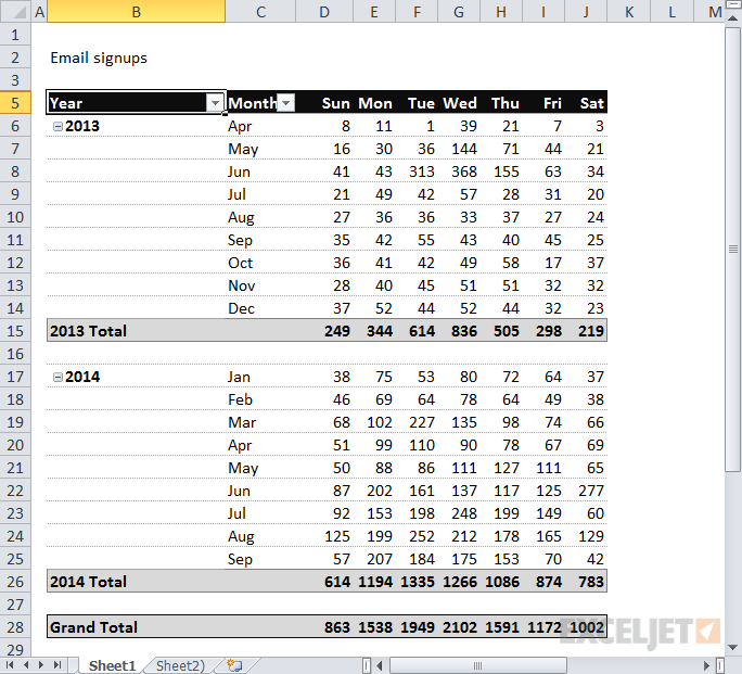
Every email sign-up to date in one tidy little pivot table
Looking at the data, you realize it would be more useful to show the total signups as a percentage rather than an absolute number. By setting the email count to display a percentage of row, the pivot table will show a breakdown by day of the week. In addition, you add conditional formatting to make the higher and lower percentages stand out. Below, we've used green for higher percentages, and blue for lower percentages.
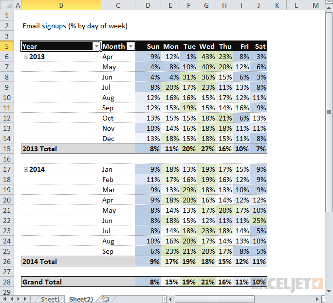
Now it's clear: most sign-ups are on weekdays. Tuesdays and Wednesdays are especially good days.
Summary
Hopefully, this short tour of "unconventional" Pivot Tables has inspired you to try some new pivot tables on your data. You don't need to have a huge set of data to see the benefit of using a pivot table. Pivot tables will save you time and energy whenever you need to create a report based on data, especially a report you'll need to update again in the future. Here are a few more helpful links and resources:
- Pivot table example: Instrument readings (video)
- Pivot table example: movie data (video)
- Pivot table example: voting results (video)
- Core Pivot (video course)