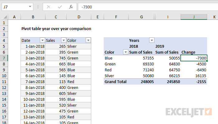
In this example, a pivot table is used to show the year-over-year change in sales across 4 categories. Change can be displayed as the numeric difference (this example) or as a percentage.
Fields
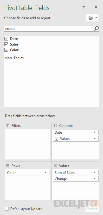
The pivot table uses all three fields in the source data: Date, Sales, and Color:
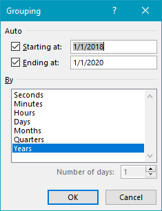
The Color field has been added as a Row field to group data by color. The Date field has been added as a Column field and grouped by year:
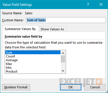
The Sales field has been added to the Values field twice. The first instance is a simple Sum of Sales:
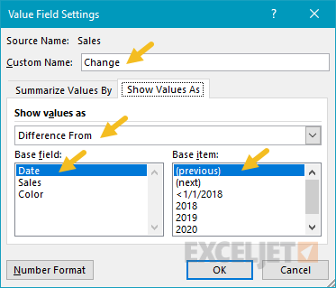
The second instance of Sales has been renamed "Count", and set to show a "Difference from" value, based on the previous year:
Note: Column H values are empty since there is no previous year. It has been hidden for cosmetic reasons only.
Steps
- Create a pivot table
- Add Color field to Rows area
- Add Date field to Columns area, group by Year
- Add Sales to Values as Sum
- Add Sales to Values, rename to "Change"
- Show values as = Difference From
- Base field = Date (or Year)
- Base item = Previous
- Hide first Change column (optional)
Notes
- To show percentage change, set Show values as to "% Difference From" in step 5 above.
- If Date is grouped by more than one component (i.e. year and month) field names will appear differently in the pivot table field list. The important thing is to group by year and use that grouping as the base field.
- As an alternative to automatic date grouping, you can add a helper column to the source data, and use a formula to extract the year. Then add the Year field to the pivot table directly.


