
Summary
Pivot tables are the fastest and easiest way to quickly analyze data in Excel. This article is an introduction to Pivot Tables and their benefits, and a step-by-step guide with sample data.
Quick Links
Pivot tables are one of the most powerful and useful features in Excel. With very little effort, you can use a pivot table to build good-looking reports for large data sets. If you need to be convinced that Pivot Tables are worth your time, watch this short video.
Grab the sample data and give it a try. Learning Pivot Tables is a skill that will pay you back again and again. Pivot tables can dramatically increase your efficiency in Excel.
What is a pivot table?
You can think of a pivot table as a report. However, unlike a static report, a pivot table provides an interactive view of your data. With very little effort (and no formulas) you can look at the same data from many different perspectives. You can group data into categories, break down data into years and months, filter data to include or exclude categories, and even build charts.
The beauty of pivot tables is they allow you to interactively explore your data in different ways.
Contents
- Sample data
- Insert Pivot table
- Add fields
- Sort by value
- Refresh data
- Second value field
- Apply number formatting
- Group by date
- Add percent of total
- Benefits summary
- More resources
Step-by-step tutorial
To understand pivot tables, you need to work with them yourself. In this section, we'll build several pivot tables step-by-step from a set of sample data. With experience, the pivot tables below can be built in about 5 minutes.
Sample data
The sample data contains 452 records with 5 fields of information: Date, Color, Units, Sales, and Region. This data is perfect for a pivot table.
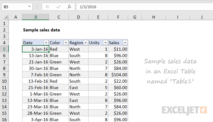
Data in a proper Excel Table named "Table1". Excel Tables are a great way to build pivot tables, because they automatically adjust as data is added or removed.
Note: I know this data is very generic. But generic data is good for understanding pivot tables – you don't want to get tripped up on a detail when learning the fun parts.
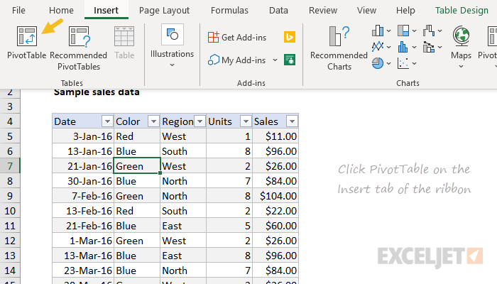
Insert Pivot Table
- To start off, select any cell in the data and click Pivot Table on the Insert tab of the ribbon:
Excel will display the Create Pivot Table window. Notice the data range is already filled in. The default location for a new pivot table is New Worksheet.
- Override the default location and enter H4 to place the pivot table on the current worksheet:
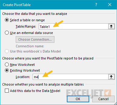
- Click OK, and Excel builds an empty pivot table starting in cell H4.
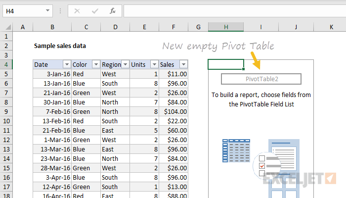
Note: there are good reasons to place a pivot table on a different worksheet. However, when learning pivot tables, it's helpful to see both the source data and the pivot table at the same time.
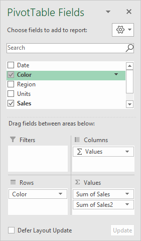
Excel also displays the PivotTable Fields pane, which is empty at this point. Note all five fields are listed, but unused:
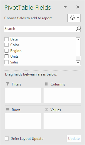
To build a pivot table, drag fields into one of the Columns, Rows, or Values area. The Filters area is used to apply global filters to a pivot table.
Note: the pivot table fields pane shows how fields were used to create a pivot table. Learning to "read" the fields pane takes a bit of practice. See below and also here for more examples.
Add fields
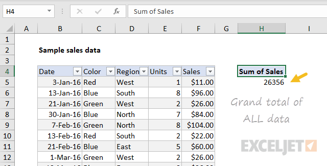
- Drag the Sales field to the Values area.
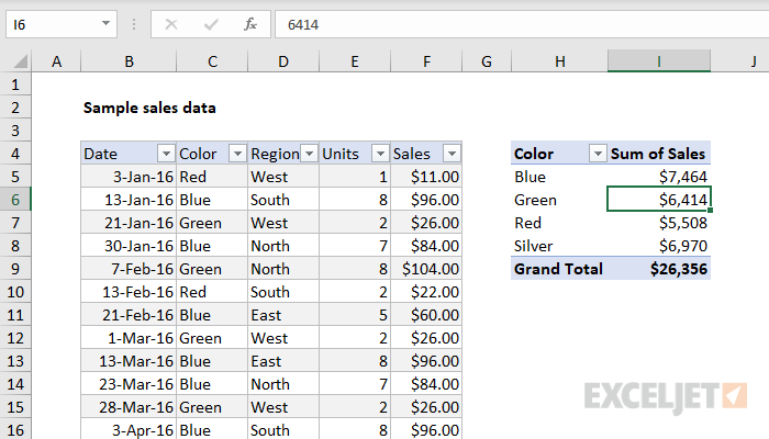
Excel calculates a grand total of 26356. This is the sum of all sales values in the entire data set:
- Drag the Color field to the Rows area.
Excel breaks out sales by Color. You can see Blue is the top seller, while Red comes in last:
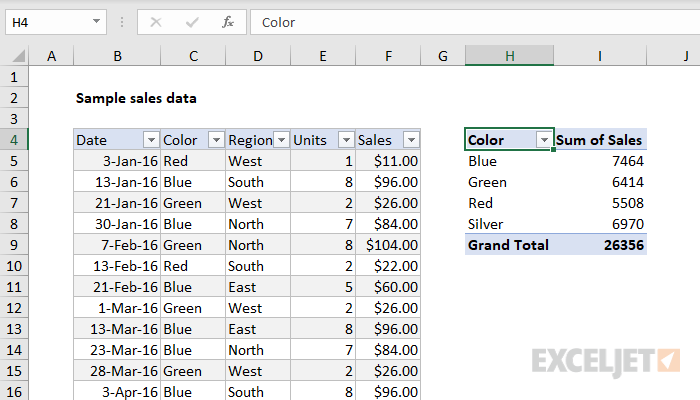
Notice the Grand Total remains 26356. This makes sense because we are still reporting on the full set of data.
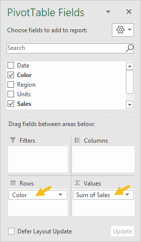
Let's take a look at the fields pane at this point. You can see Color is a Row field, and Sales is a Value field:
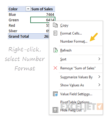
Number formatting
Pivot Tables can apply and maintain number formatting automatically to numeric fields. This is a big time-saver when data changes frequently.
- Right-click any Sales number and choose Number Format:
- Apply Currency formatting with zero decimal places, then click OK:
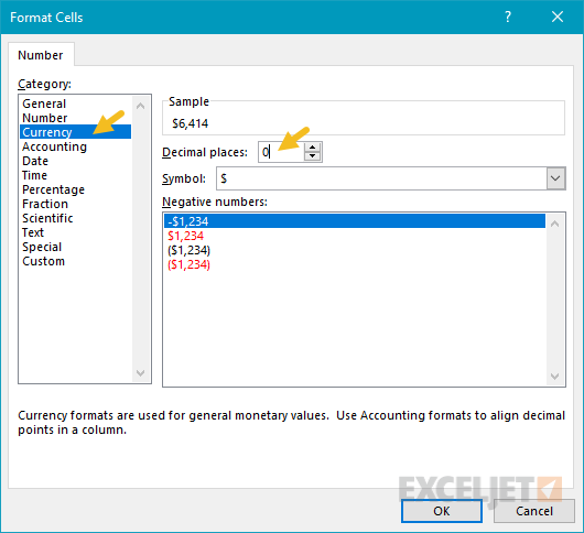
In the resulting pivot table, all sales values have Currency format applied:
Currency format will continue to be applied to Sales values, even when the pivot table is reconfigured, or new data is added.
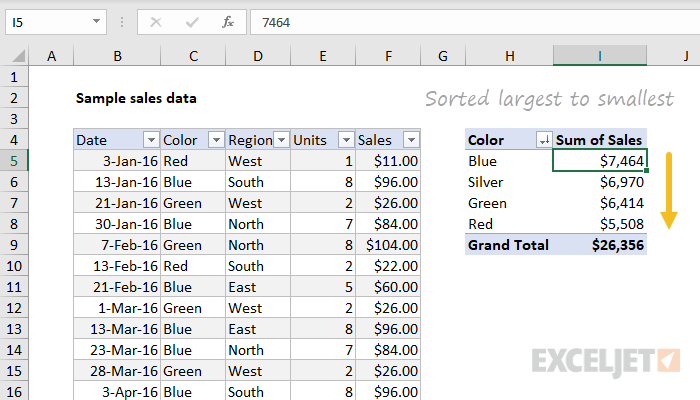
Sorting by value
- Right-click any Sales value and choose Sort > Largest to Smallest.
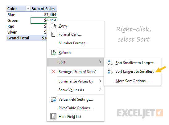
Excel now lists top-selling colors first. This sort order will be maintained when data changes, or when the pivot table is reconfigured.
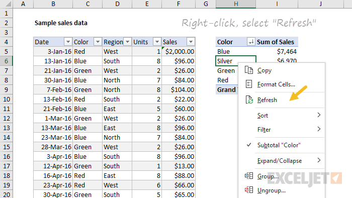
Refresh data
Pivot table data needs to be "refreshed" in order to bring in updates. To reinforce how this works, we'll make a big change to the source data and watch it flow into the pivot table.
-
Select cell F5 and change $11.00 to $2000.
-
Right-click anywhere in the pivot table and select "Refresh".
Notice "Red" is now the top-selling color, and automatically moves to the top:
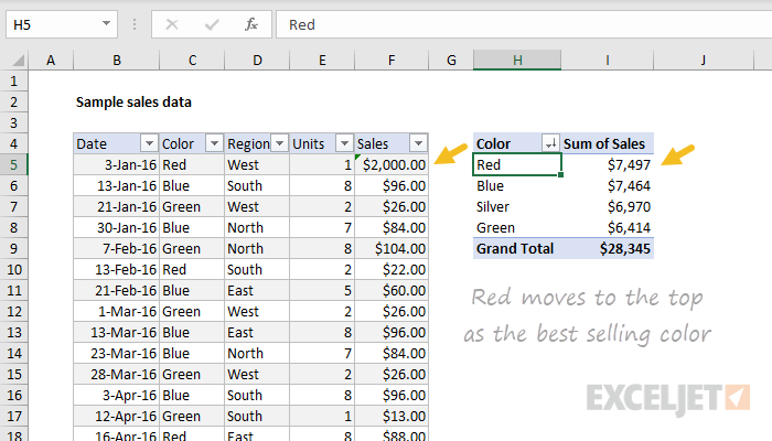
- Change F5 back to $11.00 and refresh the pivot again.
Note: changing F5 to $2000 is not realistic, but it's a good way to force a change you can easily see in the pivot table. Try changing an existing color to something new, like "Gold" or "Black". When you refresh, you'll see the new color appear. You can use undo to go back to the original data and pivot.
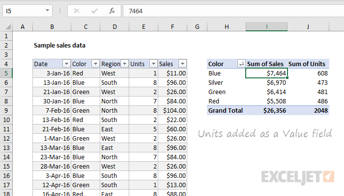
Second value field
You can add more than one field as a Value field.
- Drag Units to the Value area to see Sales and Units together:
Percent of total
There are different ways to display values. One option is to show values as a percent of the total. If you want to display the same field in different ways, add the field twice.
-
Remove the Units from the Values area
-
Add the Sales field (again) to the Values area.
-
Right-click the second instance and choose "% of grand total":
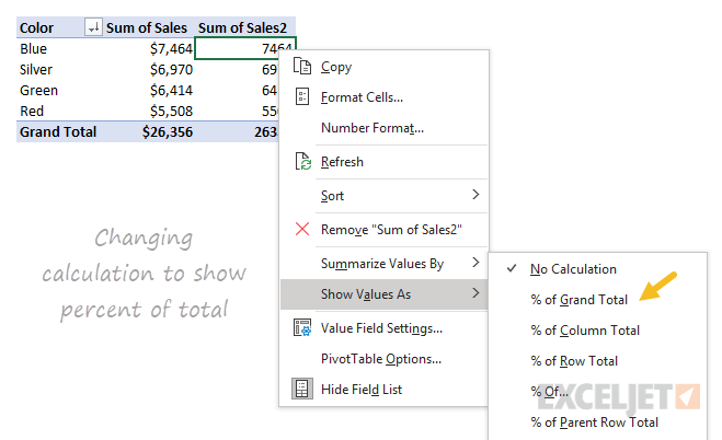
The result is a breakdown by color along with a percent of the total:
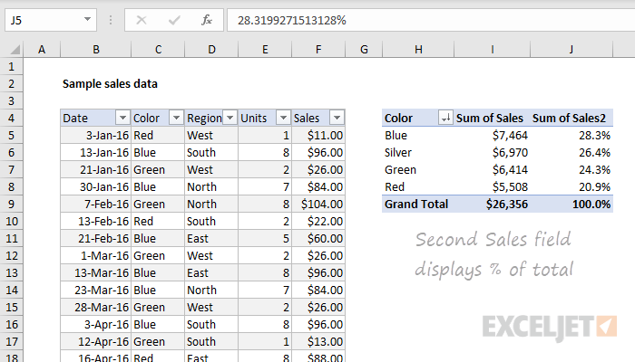
Note: the number format for percentage has also been adjusted to show 1 decimal.
Here is the Fields pane at this point:
Group by date
Pivot tables have a special feature to group dates into units like years, months, and quarters. This grouping can be customized.
-
Remove the second Sales field (Sales2).
-
Drag the Date field to the Columns area.
-
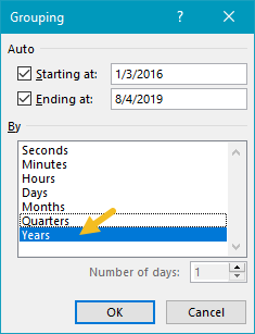
Right-click a date in the header area and choose "Group":
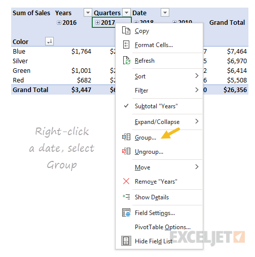
- When the Group window appears, group by Years only (deselect Months and Quarters):
We now have a pivot table that groups sales by color and year:
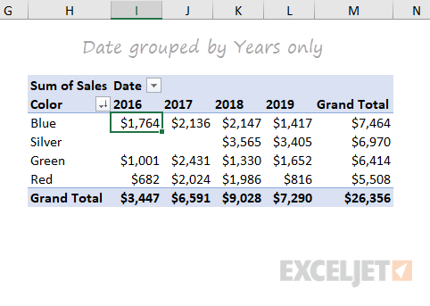
Notice there are no sales of Silver in 2016 and 2017. We can guess that Silver was introduced as a new color in 2018. Pivot tables often reveal patterns in data that are difficult to see otherwise.
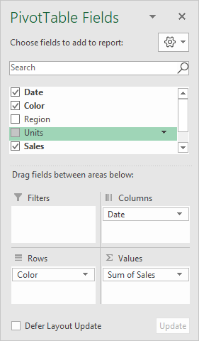
Here is the Fields pane at this point:
Two-way Pivot
Pivot tables can plot data in various two-dimensional arrangements.
-
Drag the Date field out of the columns area
-
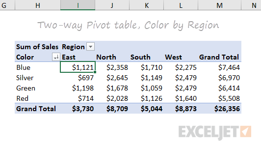
Drag Region into the Columns area.
Excel builds a two-way pivot table that breaks down sales by color and region:
- Swap Region and Color (i.e. drag Region to the Rows area and Color to the Columns area).
Excel builds another two-dimensional pivot table:
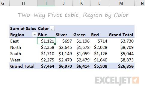
Again notice that total sales ($26,356) is the same in all pivot tables above. Each table presents a different view of the same data, so they all sum to the same total.
The above example shows how quickly you can build different pivot tables from the same data. You can create many other kinds of pivot tables, using all kinds of data.
Key Pivot Table benefits
Simplicity. Basic pivot tables are very simple to set up and customize. There is no need to learn complicated formulas.
Speed. You can create a good-looking, useful report with a pivot table in minutes. Even if you are very good with formulas, pivot tables are faster to set up and require much less effort.
Flexibility. Unlike formulas, pivot tables don't lock you into a particular view of your data. You can quickly rearrange the pivot table to suit your needs. You can even clone a pivot table and build a separate view.
Accuracy. As long as a pivot table is set up correctly, you can rest assured results are accurate. In fact, a pivot table will often highlight problems in the data faster than any other tool.
Formatting. A Pivot table can apply automatically apply consistent number and style formatting, even as data changes.
Updates. Pivot tables are designed for ongoing updates. If you base a pivot table on an Excel Table, the table resizes as needed with new data. All you need to do is click Refresh, and your pivot table will show you the latest.
Filtering. Pivot tables contain several tools for filtering data. Need to look at North America and Asia, but exclude Europe? A pivot table makes it simple.
Charts. Once you have a pivot table, you can easily create a pivot chart.