Count times in a specific range
The COUNTIFS function takes one or more criteria, entered as range/criteria pairs. In this example, the first range/criteria pair is:
B5:B11,">="&E5
Matching any time greater than or equal...Read more
The COUNTIFS function takes one or more criteria, entered as range/criteria pairs. In this example, the first range/criteria pair is:
B5:B11,">="&E5
Matching any time greater than or equal...Read more
The formula first uses the ISNUMBER function to test if the value is a number, and applies a simple logical if so:
=IF(ISNUMBER(B4)
For any number less than the value in "input", the formula will return TRUE and the conditional formatting...Read more
At the core, this is a simple formula that simply divides the total amount by the number of months given:
=amount/months
The trick is to "cancel out" this amount in months where it doesn't apply.
To do this, we use this logical...Read more
This formula uses the LOOKUP function to find and retrieve the last matching file name. The lookup value is 2, and the lookup_vector is created with this:
1/(ISNUMBER(FIND(G6,files)))
Inside this snippet, the FIND function looks for the...Read more
This formula uses COUNTIF with an expanding range to first check if the current row is the first occurrence of a given invoice number:
COUNTIF($B$5:B5,B5)=1
This expression only returns TRUE when...Read more
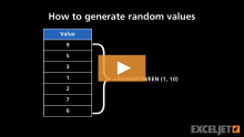
The RAND function generates a decimal number between zero and 1. So, you might get output like this from RAND() in three cells:
0.54739314
0.919767722
0.633760119
Dates in Excel are defined as simple numbers, where 1 = 1 day. This means you can simply divide 1 by...Read more
In this example, the goal is to return a list of the locations for a specific value in a 2D array of values (i.e., a table). The target value is entered in cell N5, and the table being tested is in the range C4:L16. The coordinates are supplied from row 4 and column B, as seen in the...Read more