In this video, we'll look at how to create a radar chart. Radar charts can be used to plot the performance, satisfaction, or other rating data across multiple categories in a single chart...
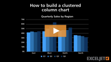
In this video, we'll look at how to build a clustered column chart in Excel. Clustered column charts can be a good way to show trends in each category, when the number of data series and categories is small...
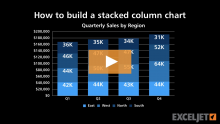
In this video, we'll look at how to create a stacked column chart. In a stacked column chart, data series are displayed as vertical columns, stacked one on top of the other...
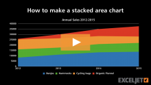
In this video, we'll look at how to make a stacked area chart. Stacked area charts are useful to show changes in a part-to-whole relationship over time...
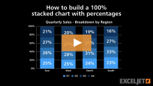
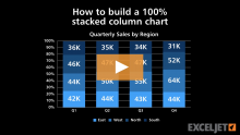
In this video, we'll look at how to create a 100% stacked column chart, which shows the proportional breakdown of multiple data series in stacked columns...
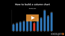
In this video, we look at how to create a basic column chart in Excel, and how to use custom number formats to show dates as month names, and currency in thousands.
In this video, we'll look at how to create a pie chart in Excel. Pie charts show a "part to whole" relationship, and they work best with a limited number of categories...