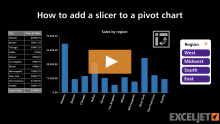
In this video, we'll look at how to add a slicer to a pivot chart. Slicers provide a powerful way to filter data interactively, and they are a key building block of many dashboards...
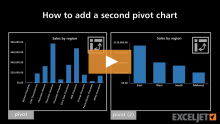
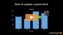
In this video, we'll look at how to add additional pivot charts based on the same data. When the data is refreshed, all charts will update at the same time...
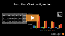
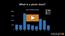
A pivot chart is always linked to a pivot table, and you can't change one without changing the other. In this video, we'll look at how a pivot table and pivot chart are connected...
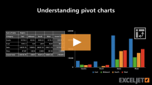
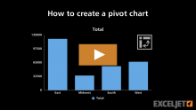
In this video, we'll look at several options for creating a pivot chart. A pivot chart is an extension of a pivot table, so in order to have a pivot chart you must also have a pivot table...
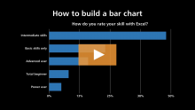
In this video, we'll look at how to create a bar chart in Excel to show survey data. Bar charts are good for long labels, since there is plenty of room for text to the left of the bars. ...